NIELSEN DATA VIZ GUIDANCE DOCUMENT
One of my primary responsibilities at Nielsen was developing guidance and training materials around visualizing data. This document is a culmination of a lot of previous work I'd done. It acts as both a "how-to" document for a very general audience, and as brand guidelines in regards to data visualization at Nielsen.
Only a portion of the document is presented on this page; for the complete document, please follow the button below.
Newswire template/style update
The example below served two primary functions: it was an update to the template (the shell) that charts and graphs would be placed within, and it was an example of what these charts and graphs should look like. The first part is pretty straightforward and really just consists of the header and footer. There were some branding considerations (switching to the "n-tab" in the top right and reducing the clutter at the bottom), but primarily I wanted to reduce the "visual loudness" of the black bars and make the title itself stand out more.
In regards to the chart itself, I kept the same visualization method in order to focus attention on a couple more subtle things that can help improve graphics: limited color, direct labeling, and removing unnecessary design elements. Legends, like the one on the left, forces viewers to dart their heads up and down to match colors with the corresponding text. By placing the text directly next to the thing it corresponds to, it makes for an easier read and allows for fewer colors to be used. Color is a tremendously powerful tool and using it to simply link a chart to a legend is not a good use of that tool.
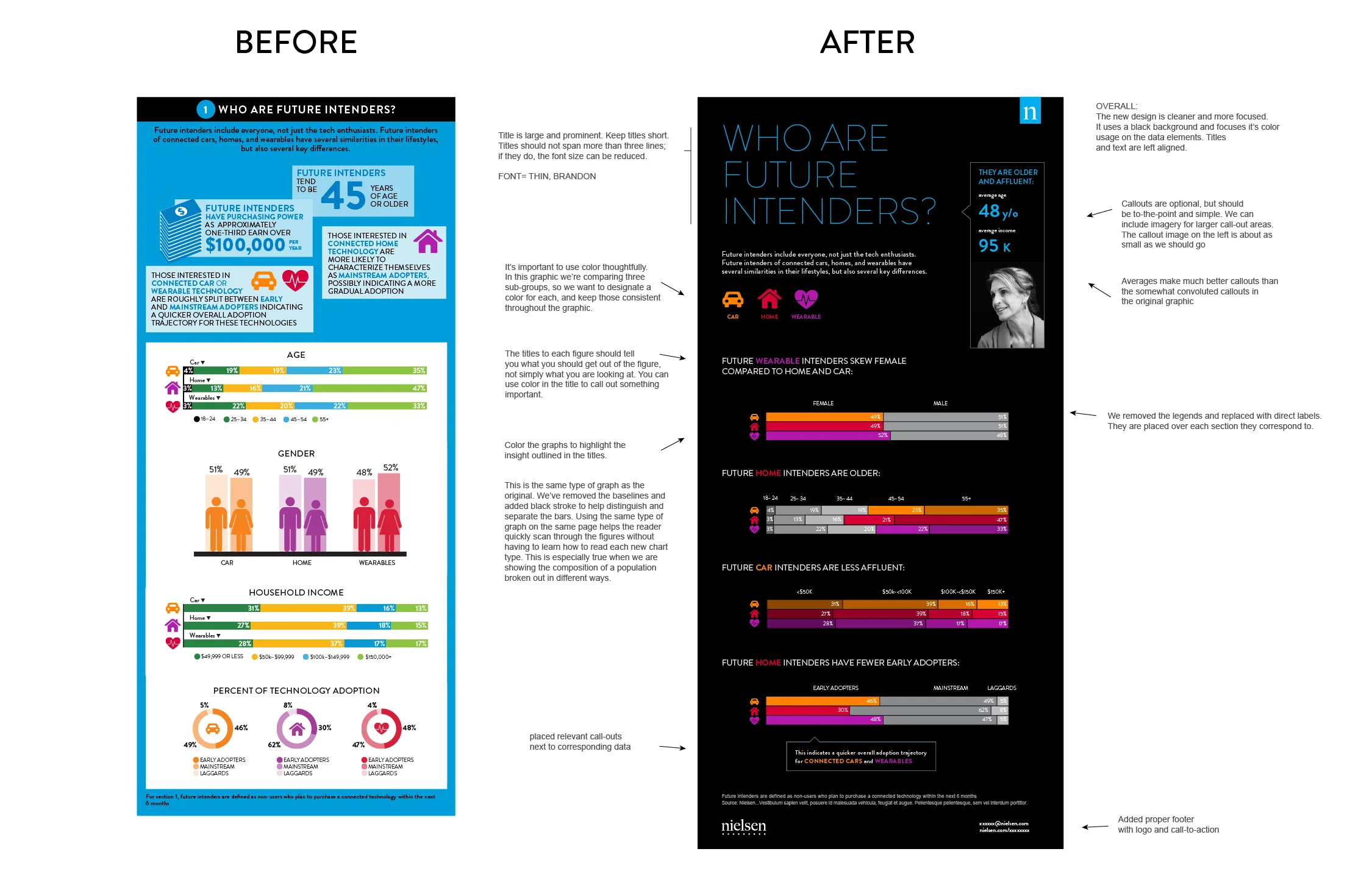
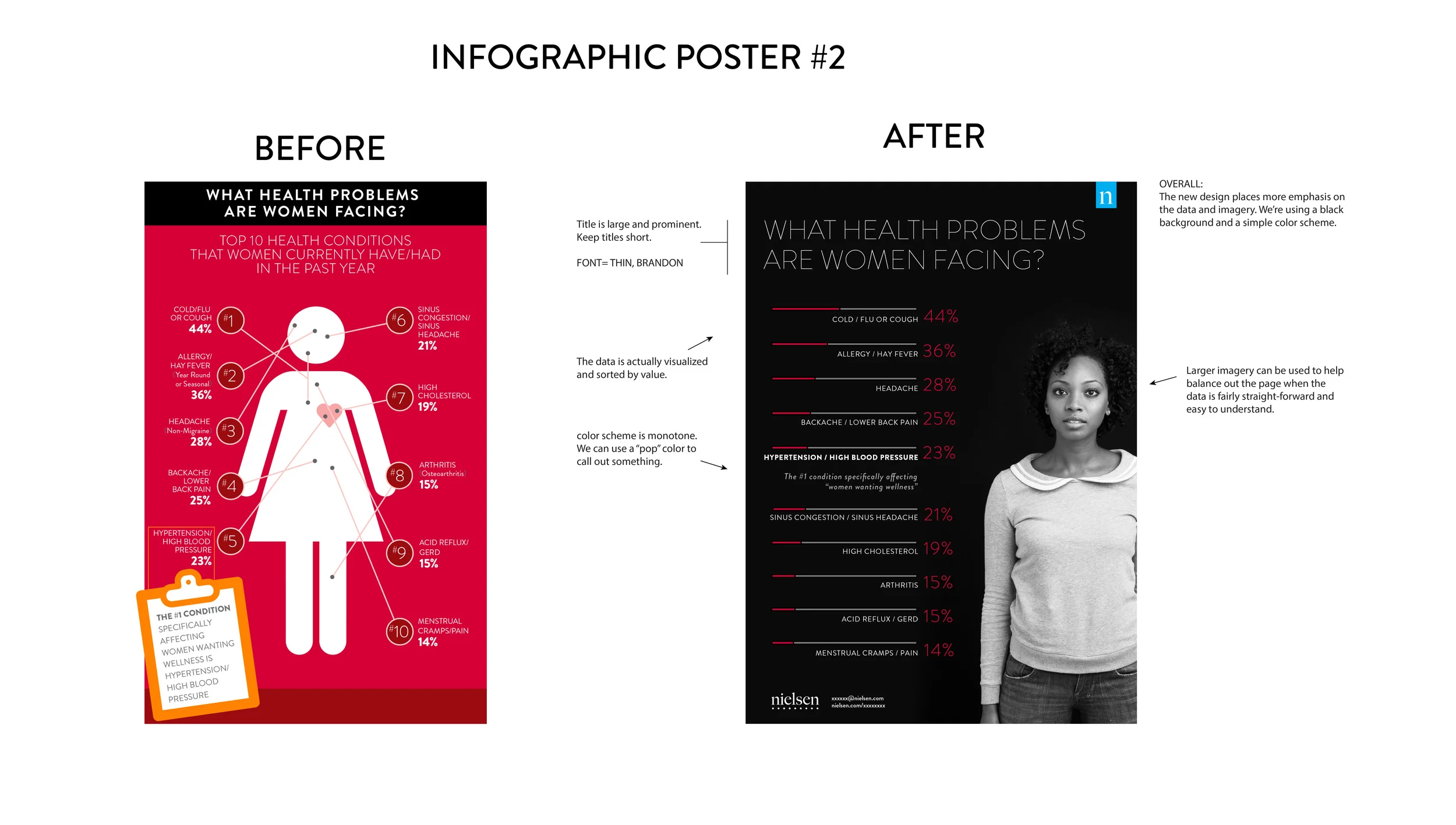
Nielsen "infographic poster" guidance/ template
FORRESTER BLOG
While at Forrester, I maintained an external blog that tackled data visualization from a high level. It explored topics like "infographics," audience, and the polarizing effect of bar charts.


