REPORT FIGURES, FrameworkS AND miscellaneous charts:
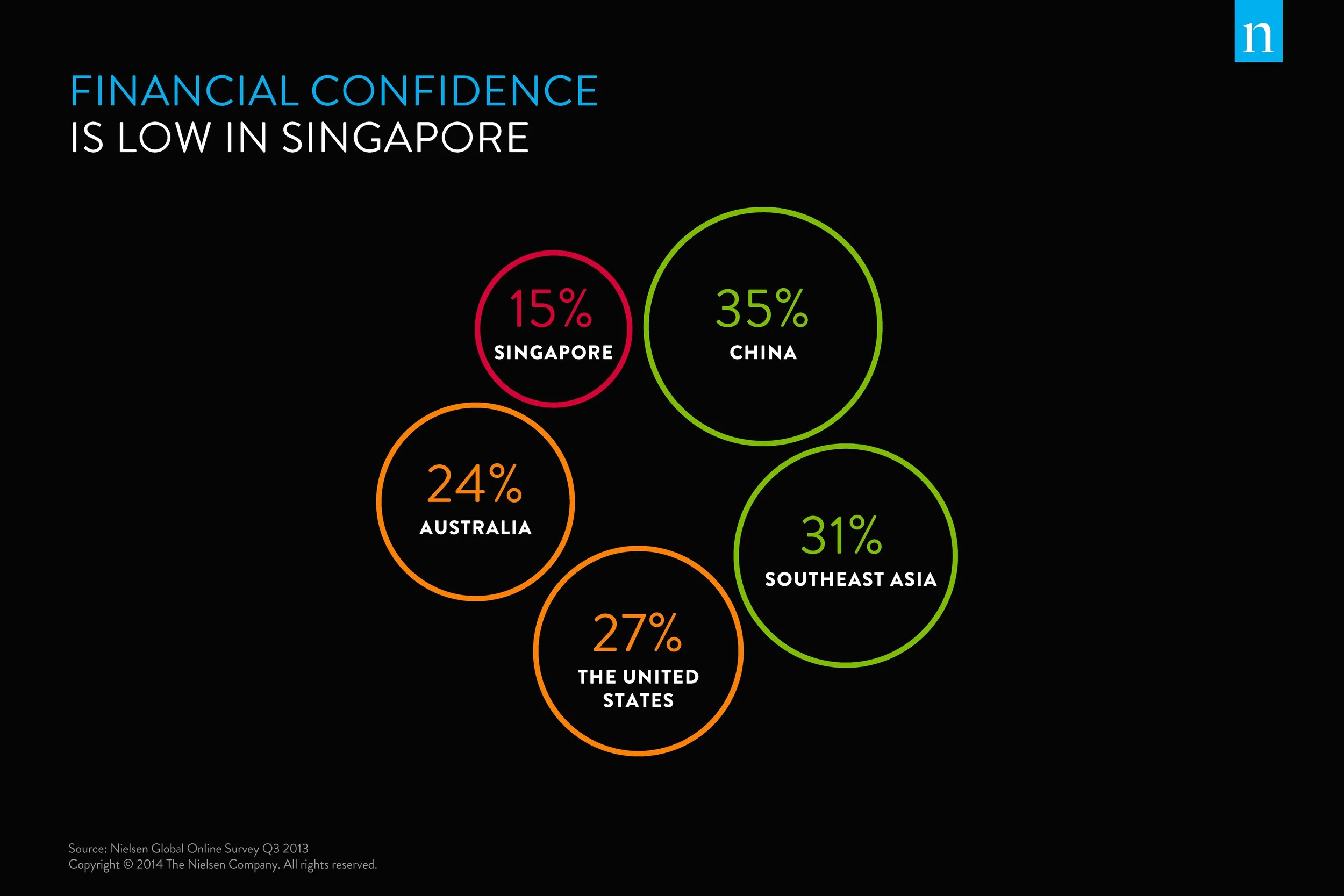
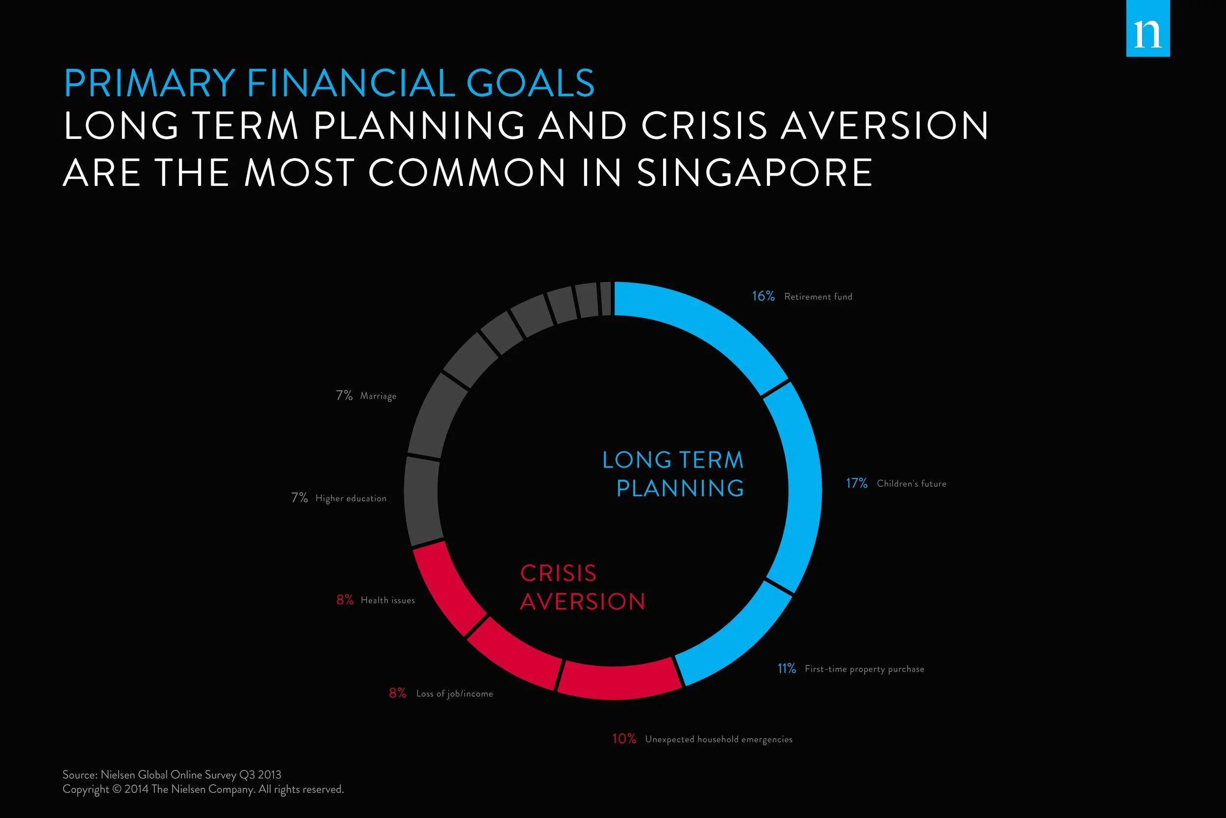
NIELSEN CMO "FIRST-LOOK" POSTER BOARDS
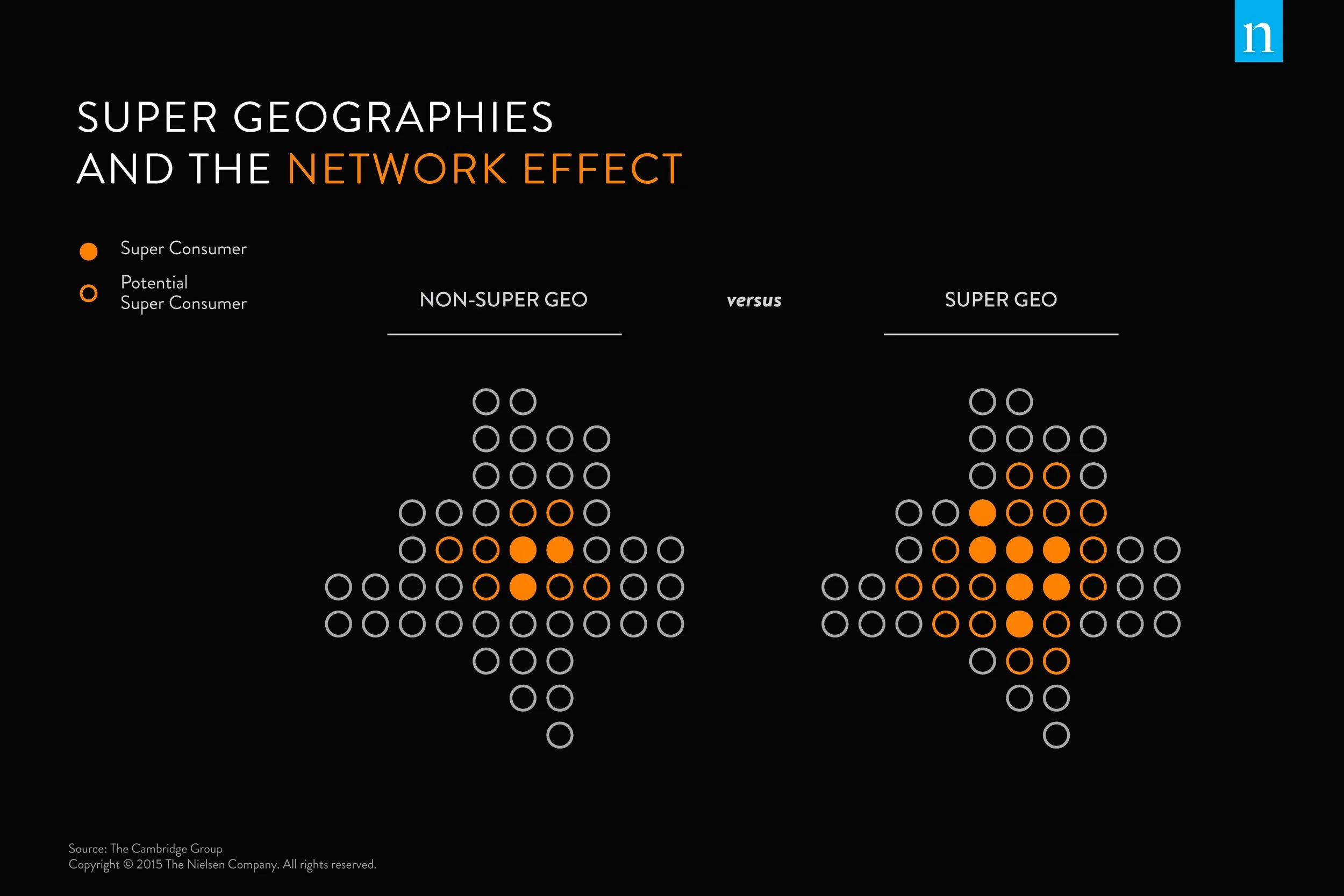
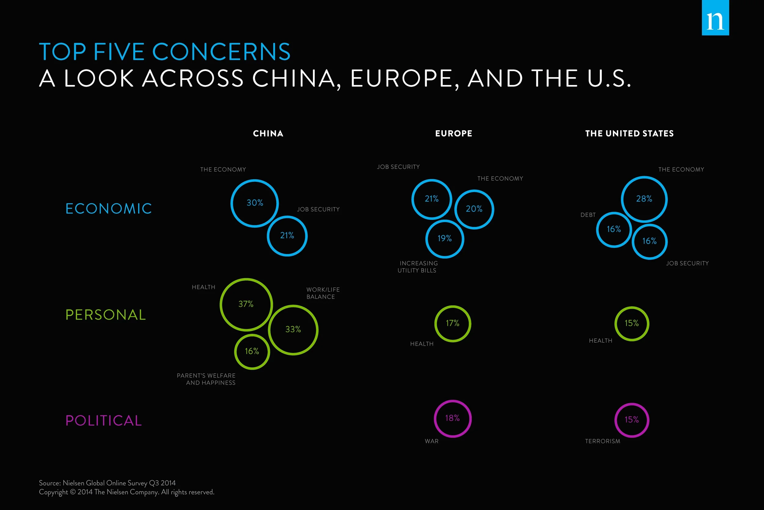
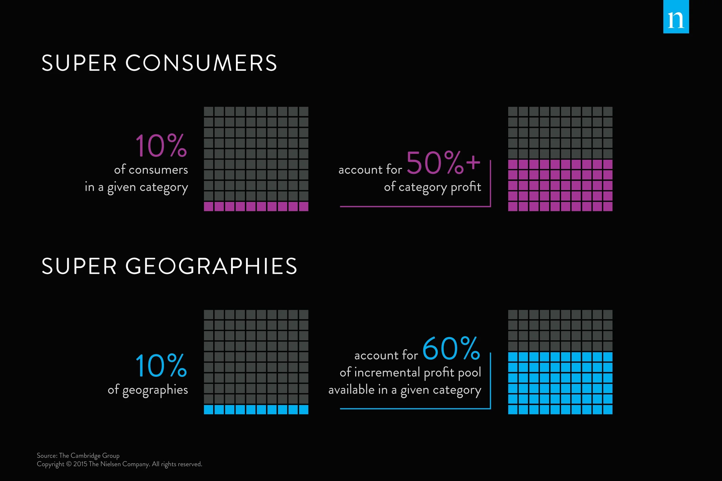
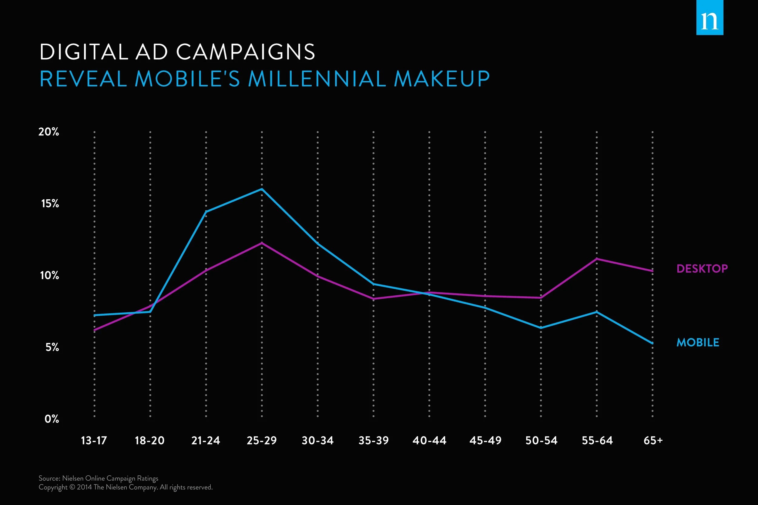
These poster boards were designed to be displayed at a series of executive events. Each board has a specific focus, dependent on the data featured at the event.
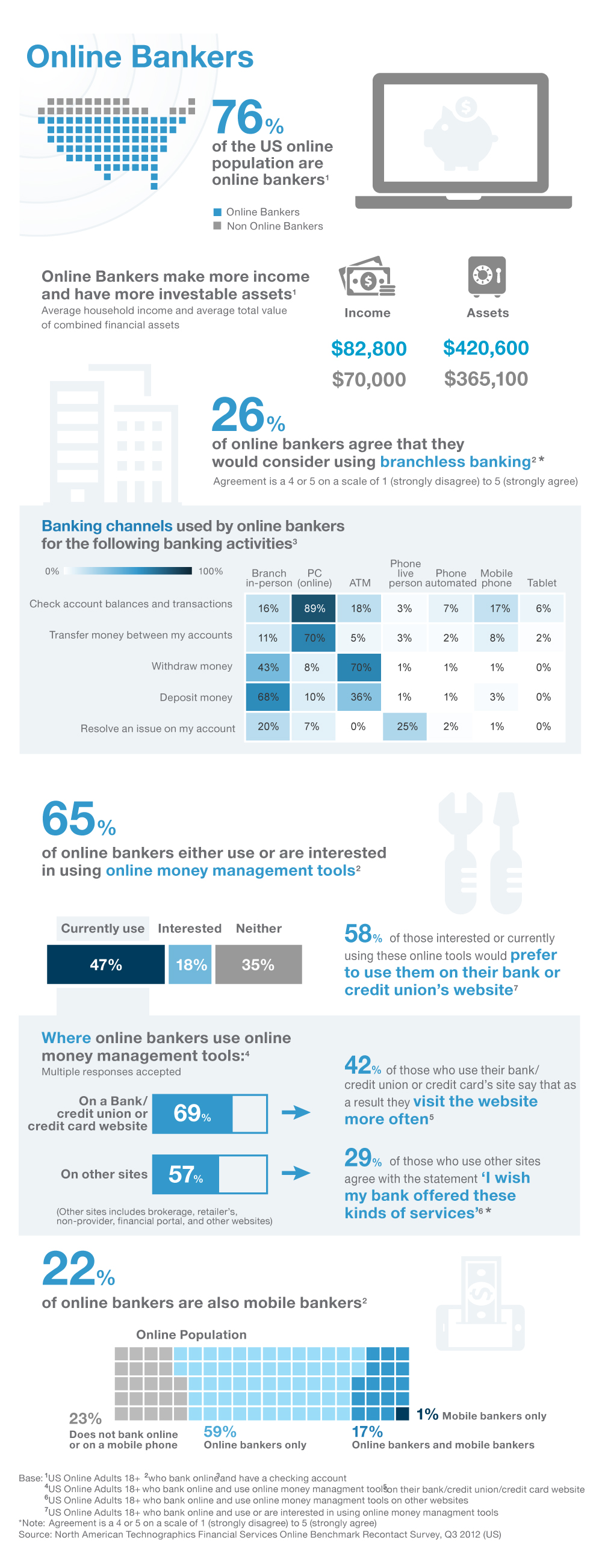
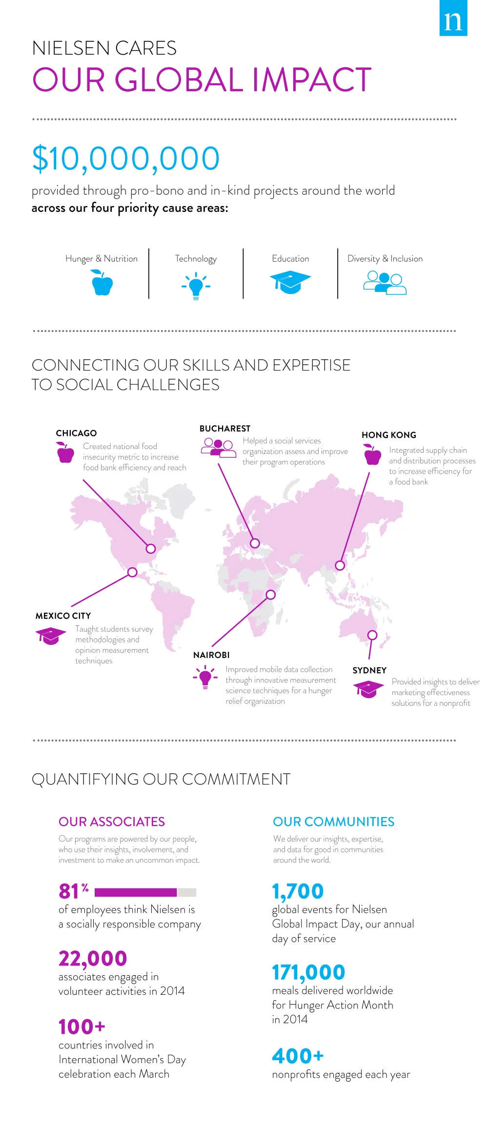
INFOGRAPHICS / DIGITAL POSTERS
This style of graphic was something I used a lot when I first experimented with visual storytelling at Forrester Research. I would conduct the research and analysis to develop some kind of narrative, and in lieu of a traditional report, I'd create these visual, data-heavy graphics. The left-most example (online bankers) is one of the first of these reports.
The example on the right is more of a marketing piece; it's less an example of data being visualized as it is an example of information being structured and organized in a clear hierarchy.
In general, I find this format ineffective. Google the word "infographic" and you'll get a litany of examples where more attention is being paid to the design elements than the data. And often, the data is oversimplified and stated without context. Instead, show your audience why something is interesting with a clear visualization. Showing someone something, and allowing them to understand it on their own, will always be more effective than simply telling someone. I wrote about this topic in a blog post while at Forrester.
THE MOBILE MIND SHIFT INDEX (Forrester):
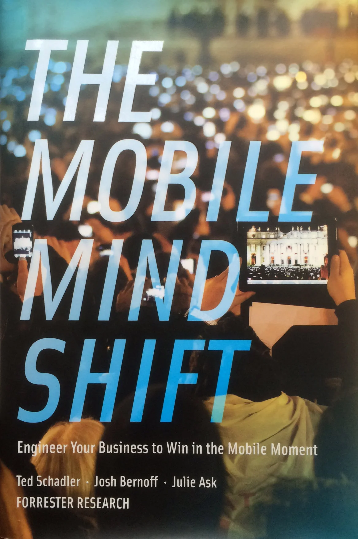
This project was for the Mobile Mind Shift book, published in 2014. The goal was to create a simple, black and white template for 5 related, but different index numbers (compared against a US average) in a book format. Three of those index numbers fall into one category (Mobile Behaviors), while the other two represent their own category. Each category needed a unique look so it could be easily recognized on it's own. The most most important index number (Mobile Intensity) needed to look like the most important and based on where that particular demographic landed on that index scale, it would indicate which segment that group fell into (either Unshifted, Transitional, or Shifted).
THE SOCIAL TECHNOGRAPHICS SCORE (FORRESTER):
Similar to the Mobile Mind Shift Index, the challenge was to create a simple, clear graphic that communicates three index numbers that are associated with a separate conceptual graphic (customer life cycle). Each of these three index numbers then contribute towards an aggregate number (overall score), which then determines a group's social savviness by placing them into the appropriate segment.
CUSTOMER EXPERIENCE INDEX UPDATE (FORRESTER)
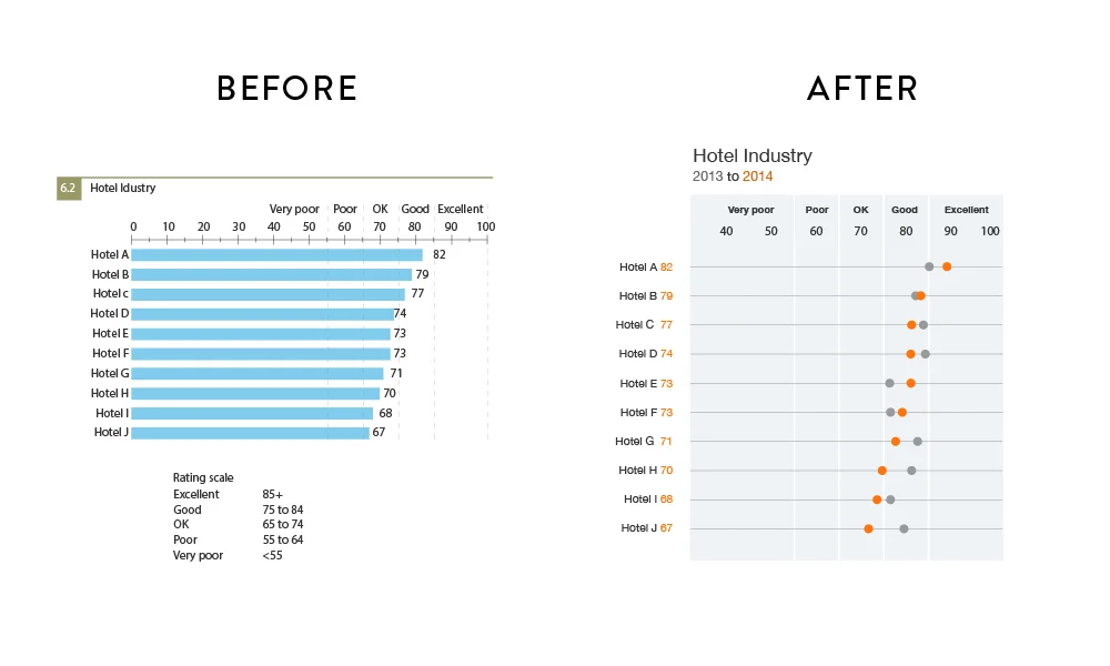
The key with this graphic was removing the unnecessary bars. When hundreds of these were stacked on top of one another in a report, the only thing a reader would notice were the bars and all the visual noise they created. When really, the only important thing is the endpoint of that bar. And, because this particular data is not about a specific quantity, the visual metaphor of the bar doesn't make all that much sense. It's not how much score you have, it's where your score lands on the spectrum. This is very similar to how we measure speed in cars. When we look at a speedometer, we only care about that end point, so the visualization method is typically just a indicator at that point, rather than a bar filling up.
TRAVEL INFOBOX (HOPPER)
This project was somewhat experimental, but the goal was to create a data-heavy, advertisement-like graphic that could be placed within travel media publications. If an article was about Last Vegas and the audience was from New York, there might be an ad like the examples below, showing all the flight data between New York and Las Vegas.


