200 years of war
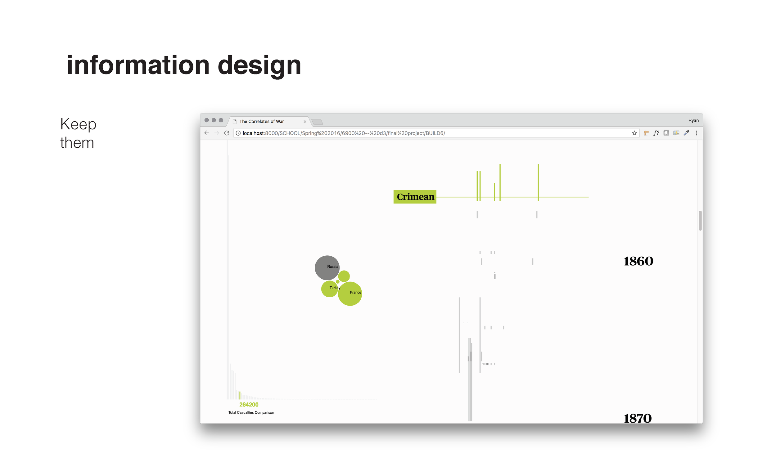
The dataset is from the Correlates of War project and tracks the last two centuries of war. We’ve set the visualization up with one primary action — scrolling. As you scroll, you move through time. Each country is ordered by region and maintains their own column. When a country becomes involved in a war, that area is denoted with a gray bar. The visualization works like a music box: as the green trigger scrolls over these bars, it highlights all the states associated with a particular war and visualizes the scale and dynamics of the war to the left, using casualty and outcome data as proxies.
It was important to us that the interface did not use buttons or gadgets for exploration. We wanted to create a seemingly simple experience for interacting with complex data.
I was the principle designer on this project; my partner was Xinhe Yu, who helped with the development.
Note: One of the biggest challenges with this project was dealing with the incredible scale of casualties from both the World Wars. We made the decision to cut off the bar chart on the left at one million casualties; the WWII bar is 16 times longer. This gives some granularity to the other wars, while still making it clear which wars had these extremely high casualties.
The massive losses during the World Wars are still captured in the individual circles, which represent the casualties per country.
Complexity without
Complication
I used this visualization for a talk I gave at Draper Laboratory in November 2017 to describe the difficult challenge of designing complex visualizations for a general audience — how to present a lot of data in a way that will bring people in quickly and keep them engaged. Using Don Norman’s framing, I’m trying to create something complex without complication (https://mitpress.mit.edu/books/living-complexity)
Below are a few of these slides with some of the contextual details I would have given with a live presentation. They provide some nice background on how this project was designed and how a lot of the specific decisions were made.
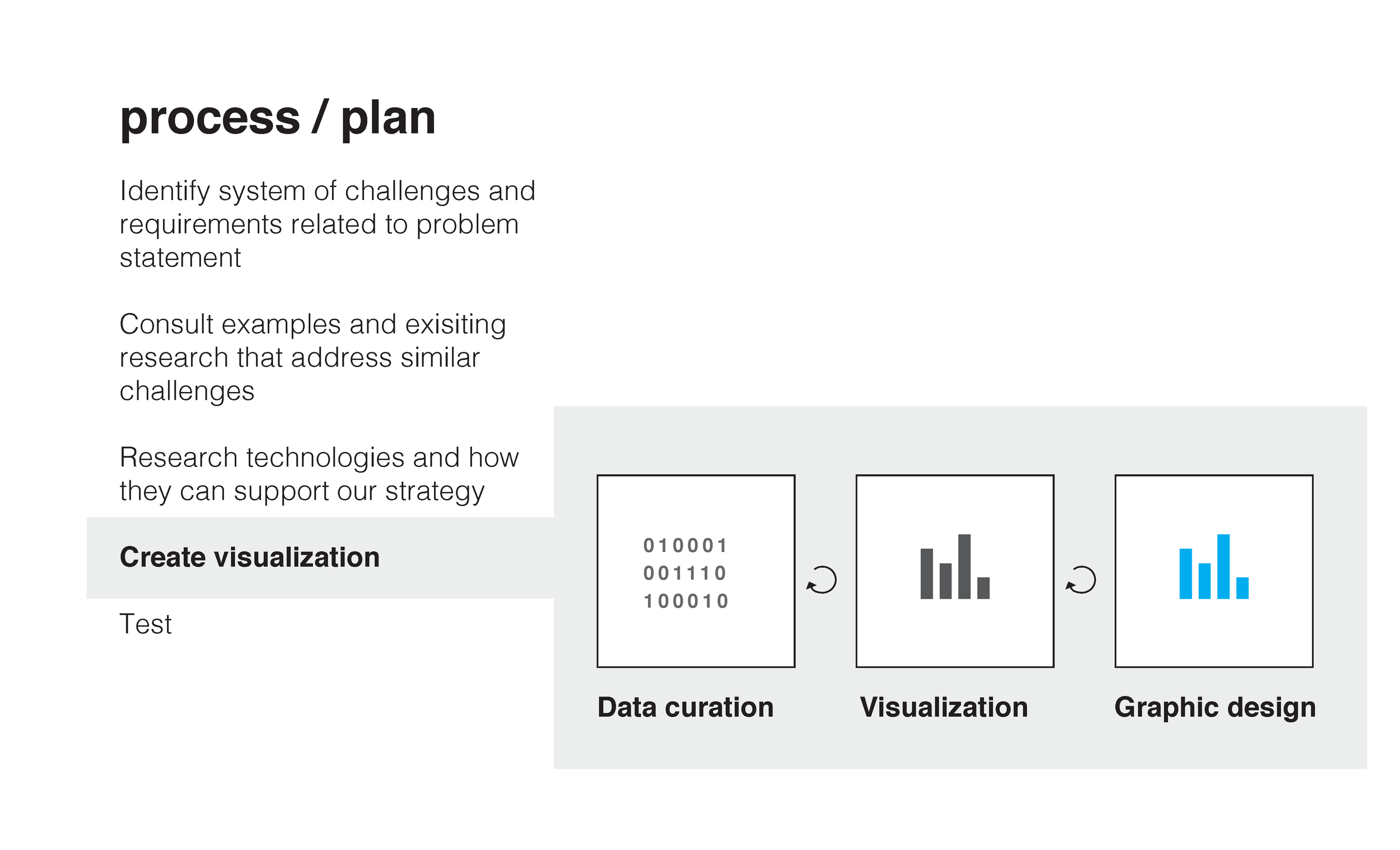
In these first two slides I lay out the basic problem and my plan and process for working through it. I also elaborate a bit on the visualization process, introducing my three stage framework.
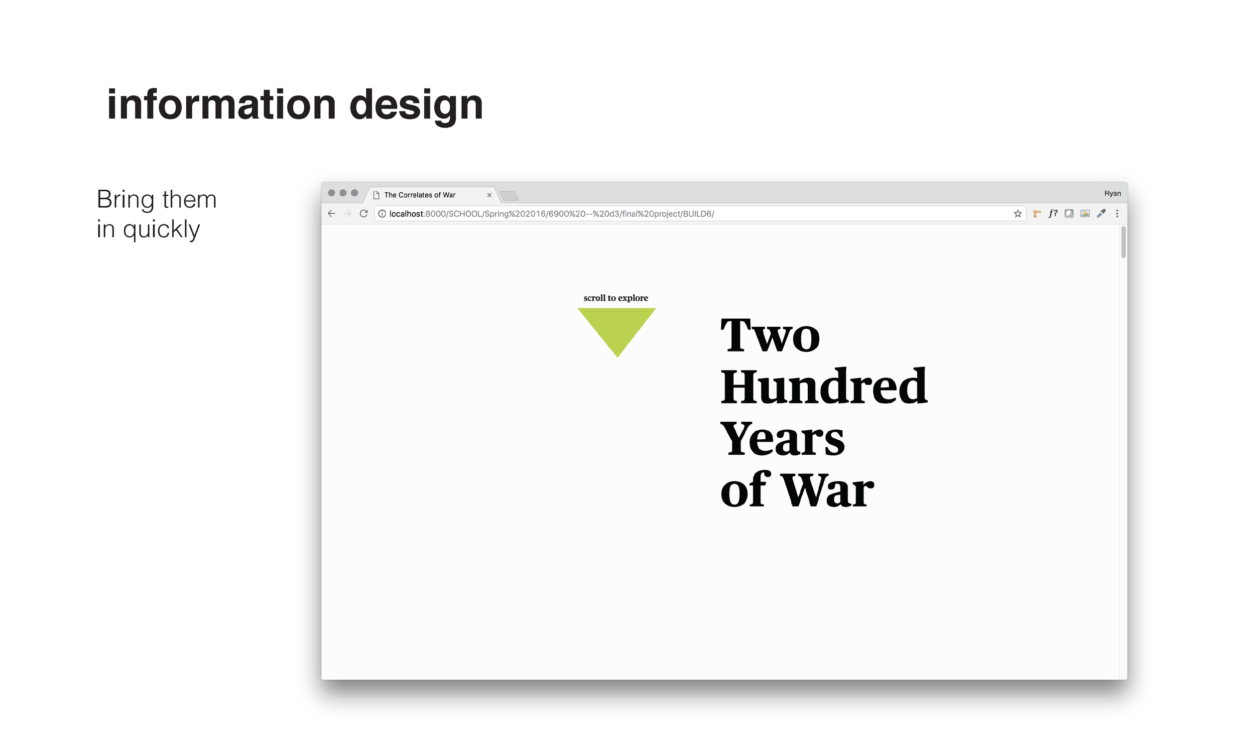
One of the keys to designing for this audience is to get them in quickly and keep them interested. Both require as little translation time as possible between the abstract shapes and colors to their intended meaning and relationships.
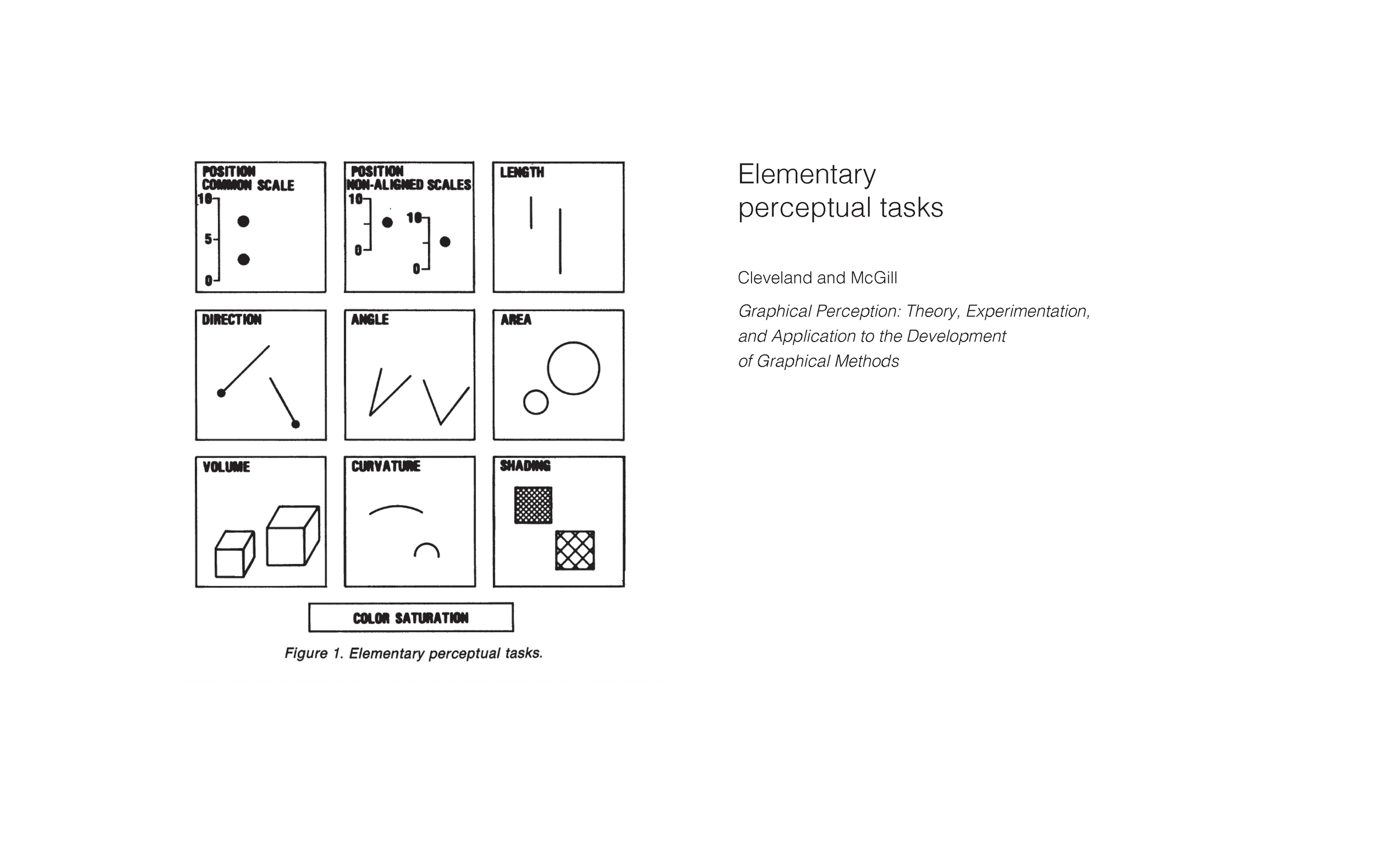
In data visualization research, there is some precedent for this translation process. A seminal work by Cleveland and McGill identified “elementary perceptual tasks” — visualization encoding mechanisms ranked based on how quickly and accurately people could extract numerical values from them.
But we need to keep in mind that accuracy of numerical extraction is only one part of effective visualizations. We still need to balance the meaning in forms themselves. For example, we can more accurately extract the numerical values from the bars — and understand their relative differences — but the form of the pie chart carries meaning and can tell us more about this data: these are parts of a whole.
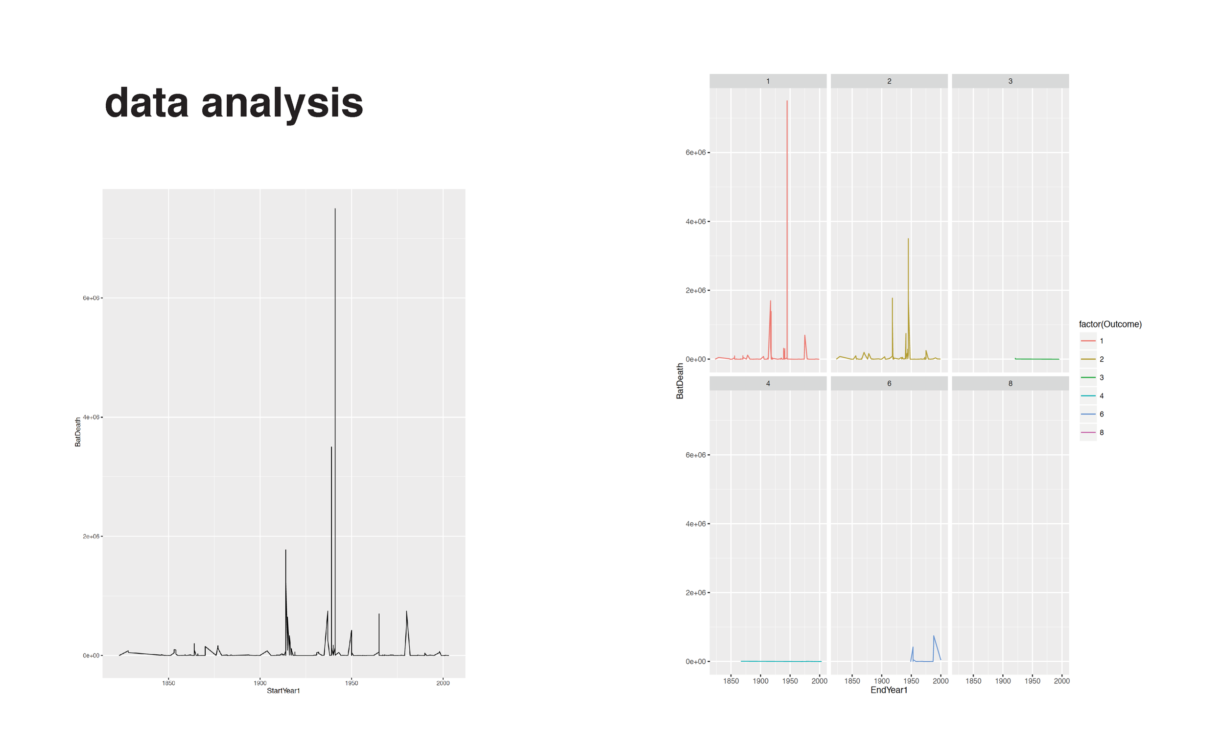
The next series of slides outline the analysis process. I believe it’s important to analyze with visualizations so we can understand the characteristics and extremes of the data — building a visual form tied to our process of understanding something. In this case, I learn quickly with some R plots how massive the casualties in the first two world wars were compared to all other wars. In these examples, I create visualization sketches with R, Illustrator, D3.js. We also sketched on whiteboards to work out how the various pieces would fit together and what it would mean to move through time.
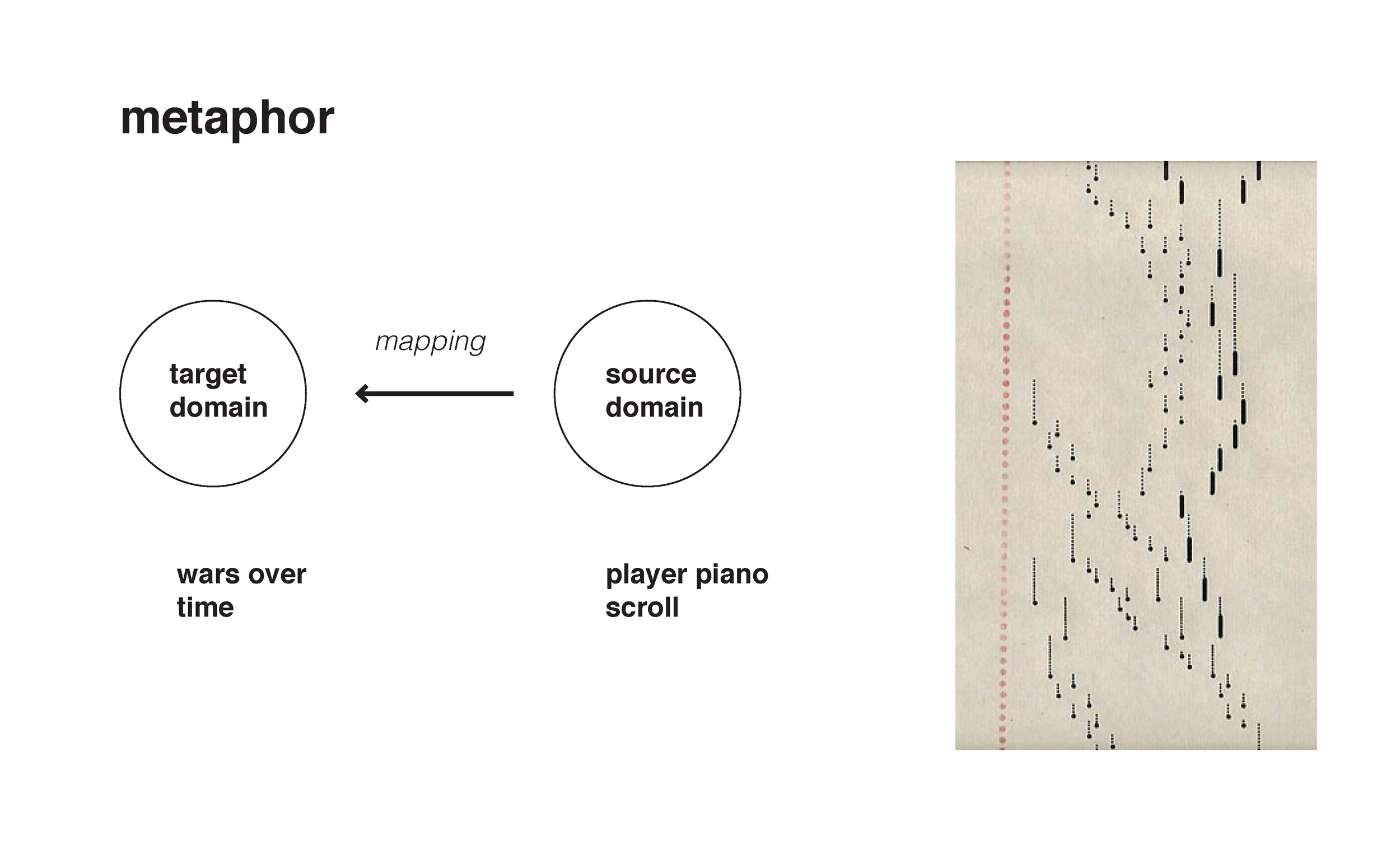
The core interaction we settled on is a figurative metaphor, taking characteristics from an unrelated concept domain (music) and applying them to the war data. By doing this, we are taking something familiar and using it as a learning tool to help people bridge the gap between abstract shapes and meaning. When a person comes into the visualization, the timeline will behave like a player piano scroll, “playing” one moment at a time, which can contain multiple notes (countries) at different lengths. We don’t take it so far as putting in music or music notes, but we subtly make decisions about interaction behavior based on how a player piano scroll would behave.
With this metaphor in place, people interact with data on their first scroll. They’re immediately in the visualization. Soon they realize that scrolling is the only thing they need to do, leaving them to explore the data that interests them, instead of trying to figure out how the visualization works or what else they can do.
The final stage of the visualization process is information design — making sure there is a clear hierarchy and that the important information and differences stand out. We fined-tuned our color choices, saving the bright, important green for the war we are profiling (instead of emphasizing one particular outcome of war) and more clearly separating the timeline from the circle visualization.


